Visier
Challenge
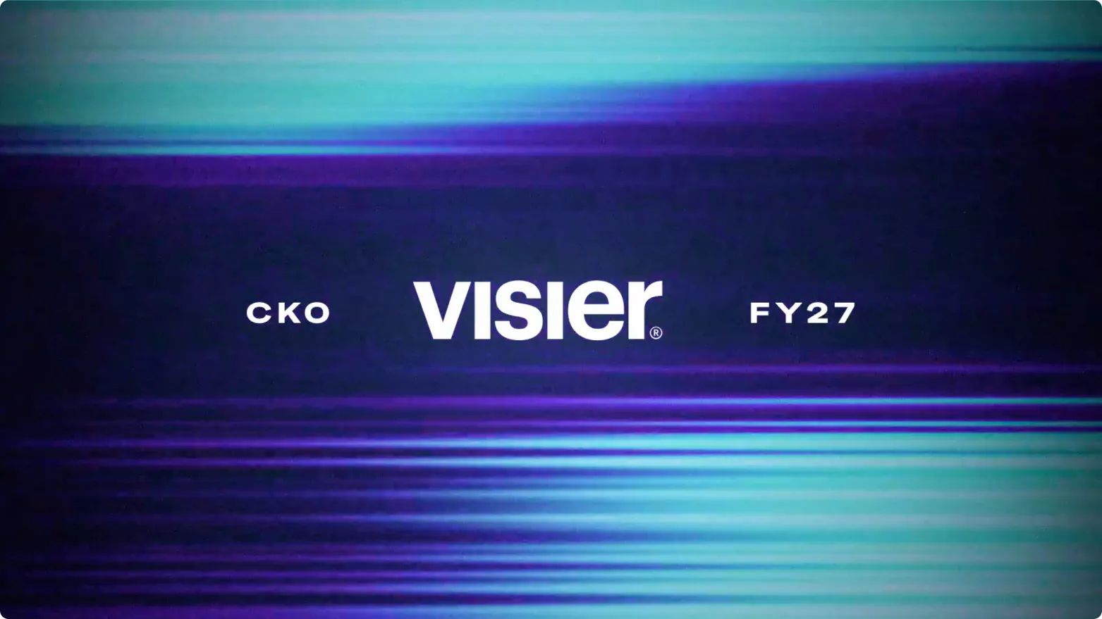
Visier needed a more defined and consistent visual identity across a growing range of brand touchpoints. The brand had to work across web, print, advertising, and larger campaign surfaces without losing clarity or cohesion. At the same time, they needed a distinct visual system for their annual conference, Outsmart, that could feel connected to the parent brand while still standing on its own.
Strategy
We approached the work as a focused brand systems project. Our role was to rework how Visier’s visual identity showed up across key surfaces, creating a clearer framework for how the brand should be expressed in different contexts. That meant defining a more cohesive design language that could scale across everyday marketing needs as well as larger brand moments.
A more flexible brand system
The updated identity was built to give Visier more consistency without making the brand feel rigid. We developed a system that could extend across digital, print, and advertising while maintaining a clear sense of hierarchy, polish, and recognizability. For Outsmart, we created a visual identity that felt distinct enough to carry the event, but still clearly part of the larger Visier brand ecosystem.
Application
Once the system was defined, it was applied across a range of surfaces to make the brand feel more unified in practice. This included web, print, advertising, and event-related materials tied to Outsmart. The goal was not just to establish a visual direction, but to show how that direction could hold together across the full range of Visier’s brand presence.
We also developed a packaging design system using color to denote boldness, country of origin, and flavor notes.
Outcome
The final result gave Visier a stronger and more unified visual presence across multiple surfaces. The new system helped the brand show up more consistently in day-to-day applications while also supporting higher-visibility moments like Outsmart with a more intentional point of view. By refining the identity at the system level, we gave the team a clearer foundation for how the brand should look and perform over time.
Challenge
Visier needed a more defined and consistent visual identity across a growing range of brand touchpoints. The brand had to work across web, print, advertising, and larger campaign surfaces without losing clarity or cohesion. At the same time, they needed a distinct visual system for their annual conference, Outsmart, that could feel connected to the parent brand while still standing on its own.
Strategy
We approached the work as a focused brand systems project. Our role was to rework how Visier’s visual identity showed up across key surfaces, creating a clearer framework for how the brand should be expressed in different contexts. That meant defining a more cohesive design language that could scale across everyday marketing needs as well as larger brand moments.


A more flexible brand system
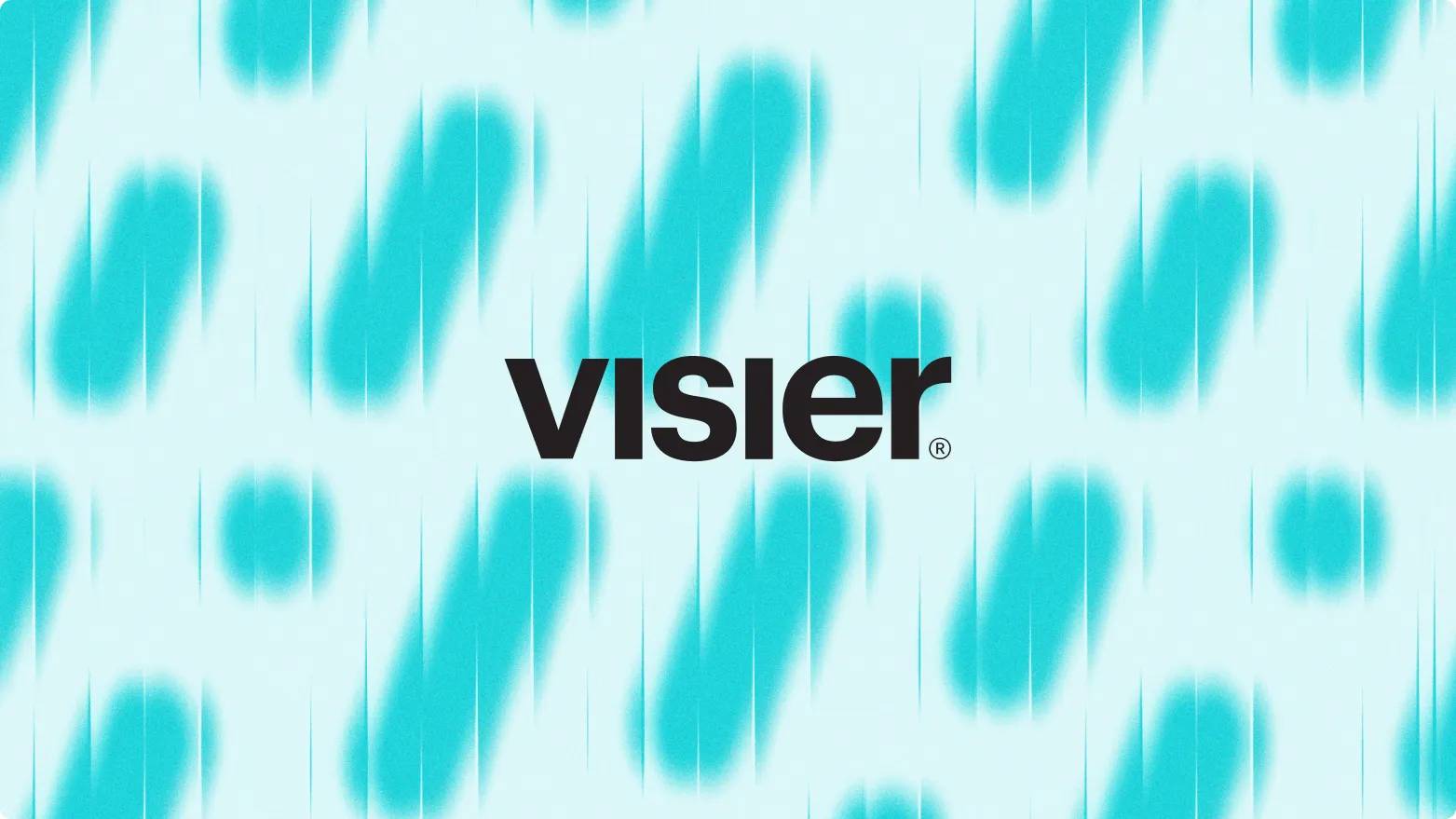
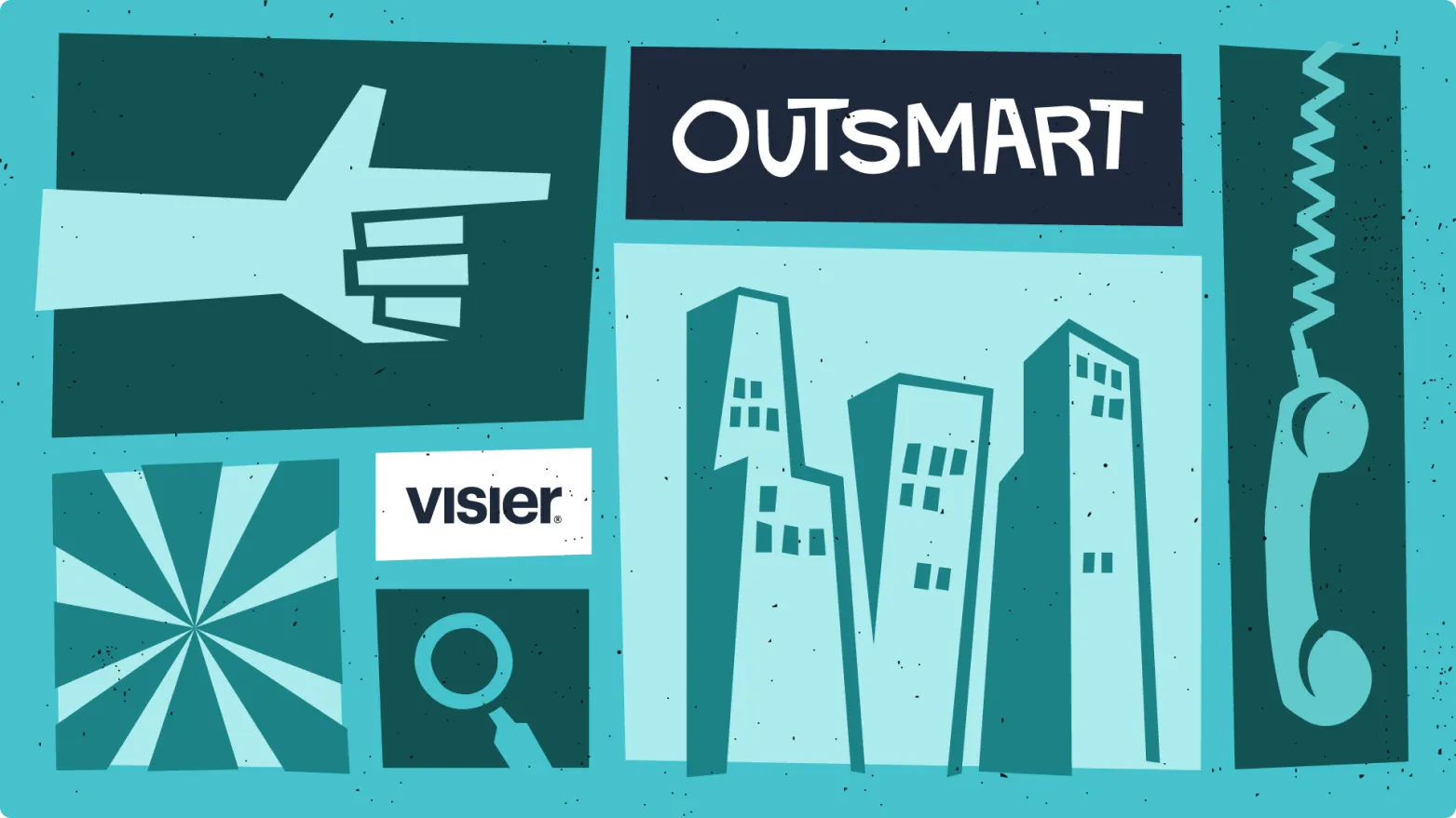
The updated identity was built to give Visier more consistency without making the brand feel rigid. We developed a system that could extend across digital, print, and advertising while maintaining a clear sense of hierarchy, polish, and recognizability. For Outsmart, we created a visual identity that felt distinct enough to carry the event, but still clearly part of the larger Visier brand ecosystem.


Application
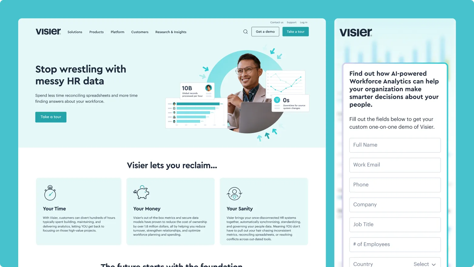
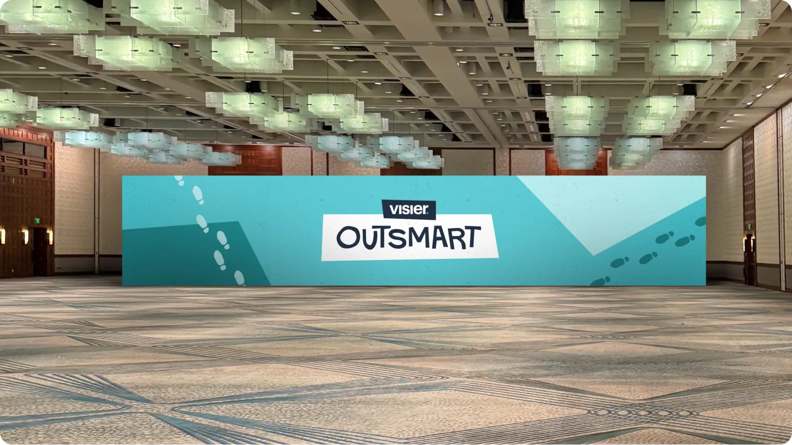
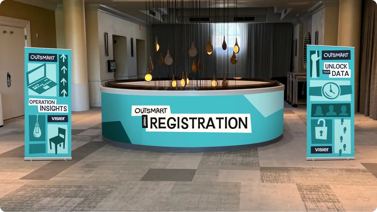
Once the system was defined, it was applied across a range of surfaces to make the brand feel more unified in practice. This included web, print, advertising, and event-related materials tied to Outsmart. The goal was not just to establish a visual direction, but to show how that direction could hold together across the full range of Visier’s brand presence.
We also developed a packaging design system using color to denote boldness, country of origin, and flavor notes.
Outcome
The final result gave Visier a stronger and more unified visual presence across multiple surfaces. The new system helped the brand show up more consistently in day-to-day applications while also supporting higher-visibility moments like Outsmart with a more intentional point of view. By refining the identity at the system level, we gave the team a clearer foundation for how the brand should look and perform over time.