Havenmark
Challenge
Capital Insurance & Investment Planning had built a strong advisory business, but the brand did not reflect the level of trust, clarity, and professionalism behind the firm. As they prepared to transition to the new name, Havenmark Advisors, they needed an identity that felt more focused and better aligned with the quality of their services. The challenge was to create a brand that felt established, personal, and credible without relying on the usual financial industry clichés.
Strategy
Our role was to help vet the new name and build a brand system around it that felt clear, confident, and timeless. We focused on creating an identity that could support the full scope of the firm while giving it a stronger and more ownable presence in the market. Every part of the system was designed to make the brand feel more cohesive and intentional.
A more distinctive financial brand
The Havenmark identity was designed to feel polished, steady, and approachable. We paired classic typography with a structured visual system and refined color palette to create a brand that feels both elevated and familiar. The new identity helped make the name feel real and established, while giving the firm a more consistent foundation across marketing materials and brand touchpoints.
Outcome
The final result is a rebrand that gives Havenmark Advisors a clearer and more distinctive presence. The new identity feels more aligned with the quality of the firm’s advisory work and better supports its next stage of growth. By helping shape the name and the system around it, we gave the team a brand that feels more confident, cohesive, and built to last.
Challenge
Capital Insurance & Investment Planning had built a strong advisory business, but the brand did not reflect the level of trust, clarity, and professionalism behind the firm. As they prepared to transition to the new name, Havenmark Advisors, they needed an identity that felt more focused and better aligned with the quality of their services. The challenge was to create a brand that felt established, personal, and credible without relying on the usual financial industry clichés.

Strategy
Our role was to help vet the new name and build a brand system around it that felt clear, confident, and timeless. We focused on creating an identity that could support the full scope of the firm while giving it a stronger and more ownable presence in the market. Every part of the system was designed to make the brand feel more cohesive and intentional.


A more distinctive financial brand
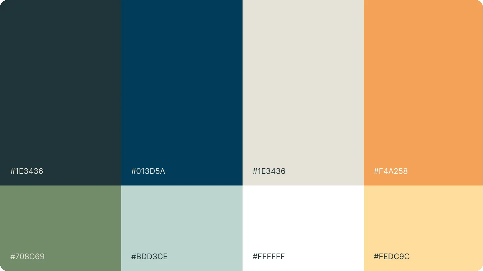
The Havenmark identity was designed to feel polished, steady, and approachable. We paired classic typography with a structured visual system and refined color palette to create a brand that feels both elevated and familiar. The new identity helped make the name feel real and established, while giving the firm a more consistent foundation across marketing materials and brand touchpoints.

Outcome
The final result is a rebrand that gives Havenmark Advisors a clearer and more distinctive presence. The new identity feels more aligned with the quality of the firm’s advisory work and better supports its next stage of growth. By helping shape the name and the system around it, we gave the team a brand that feels more confident, cohesive, and built to last.